How to Make 4K Thumbnail for YouTube: Tips for Eye-Catching Designs
How to Make 4K Thumbnail for YouTube: Tips for Eye-Catching Designs
YouTube thumbnails are an integral part of any creator's success on the platform. Think back to the last YouTube video you clicked on: it probably had a pretty good thumbnail! The top YouTube channels seem to have great thumbnails down to a science, so we're revealing everything you need to know to make high-quality thumbnails that stand out!
Understanding YouTube Thumbnails
Before we get into the process of creating great YouTube video thumbnails, it's important to understand how thumbnails work. So many parts of being a creator on the platform have to do with understanding the workings of YouTube's algorithm. YouTube thumbnails are not one of them. Instead, you should focus on the psychology of users on the platform. The key is to understand what makes a video worthy of being selected out of a vast sea of competitors. Intrigue, relevance, mystery, shock factor, and visual coherence all work together to portray the story you're about to tell. When it comes to YouTube videos, people do judge the book by its cover.
Before we get into the minutiae of crafting a great YouTube thumbnail, you should know that the ideal thumbnail looks visually appealing, works in tandem with the video title, follows the principles of visual hierarchy, and depicts the crux of the YouTube video.
Why YouTube Thumbnails Matter So Much
While getting clicks is the end goal, the thumbnails play the role of catching the viewer's attention as they peruse and scroll the platform, bombarded with a plethora of videos from all sorts of YouTube channels. A good thumbnail is the first impression that makes your prospective viewer go 'oh, that's interesting; let's take a look at the title to get some more context'.
We know that roughly 55% of human communication is nonverbal, which ties nicely into our earlier point about optimizing for the human psyche. The thumbnail is a visual summarization of your video - which is why, just like with titles, don't promise or tease anything that your video doesn't have. This makes thumbnails perhaps the most important part of your video to work on for that sweet clickthrough rate (CTR). You can sometimes get by with a mediocre video title, but you'd be hard-pressed to find a successful YouTube channel using subpar thumbnails.
Choosing The Right Editing Software
You're going to need some kind of video editing software to craft custom thumbnails. While there are many great free options, such as pxlr, or even dedicated thumbnail maker apps that will serve you well as a YouTube thumbnail maker, we recommend taking the time to learn a full-fledged editing software. Not only will it be a more powerful means of expressing your creativity, but as a content creator you may find yourself needing to work on graphic design and editing images fairly often, so it's good to have the right tool for the job. Here are a few good options to consider.
Adobe Photoshop
Adobe Photoshop is the industry-standard image editing software used by professional designers and photographers worldwide. With over 30 years of development, it offers the most comprehensive set of tools and capabilities for image manipulation and design.
Advantages:
A high degree of control over every part of your thumbnail design
Cutting/cropping subjects and changing backgrounds is very simple with the Photoshop selection tools
A massive list of plugins available for additional functionality is great for those with particular needs
Excellent if you're already a part of the Adobe Creative Cloud ecosystem
More tutorials and educational material for Photoshop than perhaps any other competitor
Disadvantages:
Subscription model is pricey ($22.99/month)
Requires significant time to master
System requirements are fairly demanding
If thumbnail creation is your only use case, this is overkill
GIMP

GIMP (GNU Image Manipulation Program) is a free, open-source alternative to Photoshop that has been developed by volunteers since 1996. It provides many professional-grade editing capabilities without the cost.
Advantages:
Completely free
Also available on Linux
Powerful enough for thumbnail-related tasks
A thriving community that provides tutorials, plugins, and support
Disadvantages:
Not the best interface when compared to other options
Performance isn't always top-notch, particularly with complex operations
Some advanced features found in options such as Photoshop aren't as intuitive or are absent
Learning material is more limited than options like Photoshop
Canva
Canva is a web-based design platform launched in 2013 that has quickly become popular for its accessibility and template-driven approach. It's specifically designed to help non-designers create professional-looking graphics.
Advantages:
Extremely user-friendly with drag-and-drop functionality
Straightforward and intuitive interface
Has quick features like AI background removal
Has a library of free YouTube thumbnail templates which serve as a good starting point
Functionality in free tier is enough for making basic thumbnails
Completely cloud-based so no system requirements and can be accessed from anywhere
Disadvantages:
Not as advanced as other options
The more appealing design elements require the paid version ($6.50/month)
Custom and complex designs can be difficult to make
Can't be accessed offline
Figma

Figma is a collaborative design tool launched in 2016 that has quickly become popular for UI/UX design. While not primarily built for photo editing, it excels at creating consistent design systems.
Advantages:
Allows real-time collaboration if more than one person is working on thumbnails
Cloud-based so no system requirements
The component-based approach lends itself well to consistent thumbnail designs
Excellent for creating thumbnail templates that can be reused
Free tier is great for smaller creators
Disadvantages:
Since this is primarily a design software, photo editing isn't its forte
Requires more effort the some other options to learn
You may need to use another software for more advanced photo editing tasks
Adobe Express
Adobe Express is Adobe's answer to Canva, offering a simplified creative experience focused on quick, template-based designs. Launched in 2016 and rebranded in 2021, it bridges the gap between professional Adobe tools and beginner-friendly platforms.
Advantages:
Easier to learn and more accessible for beginners than Photoshop
High-quality templates specifically tailored for YouTube thumbnails
Has one-click features like background removal
Has a free tier
Disadvantages:
Not as good as Photoshop for advanced image editing
Has limited customization
Many advanced features require a subscription ($9.99/month)
Harder to make custom designs that deviate from the template formats
Eye-catching YouTube Thumbnail Design
Best YouTube Thumbnail Size
Google generally recommends a YouTube thumbnail size of 1280 x 720 pixels (16:9 aspect ratio). However, for the best quality, especially on larger displays, we recommend creating thumbnails in 4K (3840 x 2160 pixels) so the image quality is maintained across all devices.
Pay attention to file format as well. Save your thumbnails as JPG or PNG with a maximum file size of 2 MB. Of the two, PNG is generally good for when you need transparency whereas JPG is preferred for photographic elements.
Visual Hierarchy
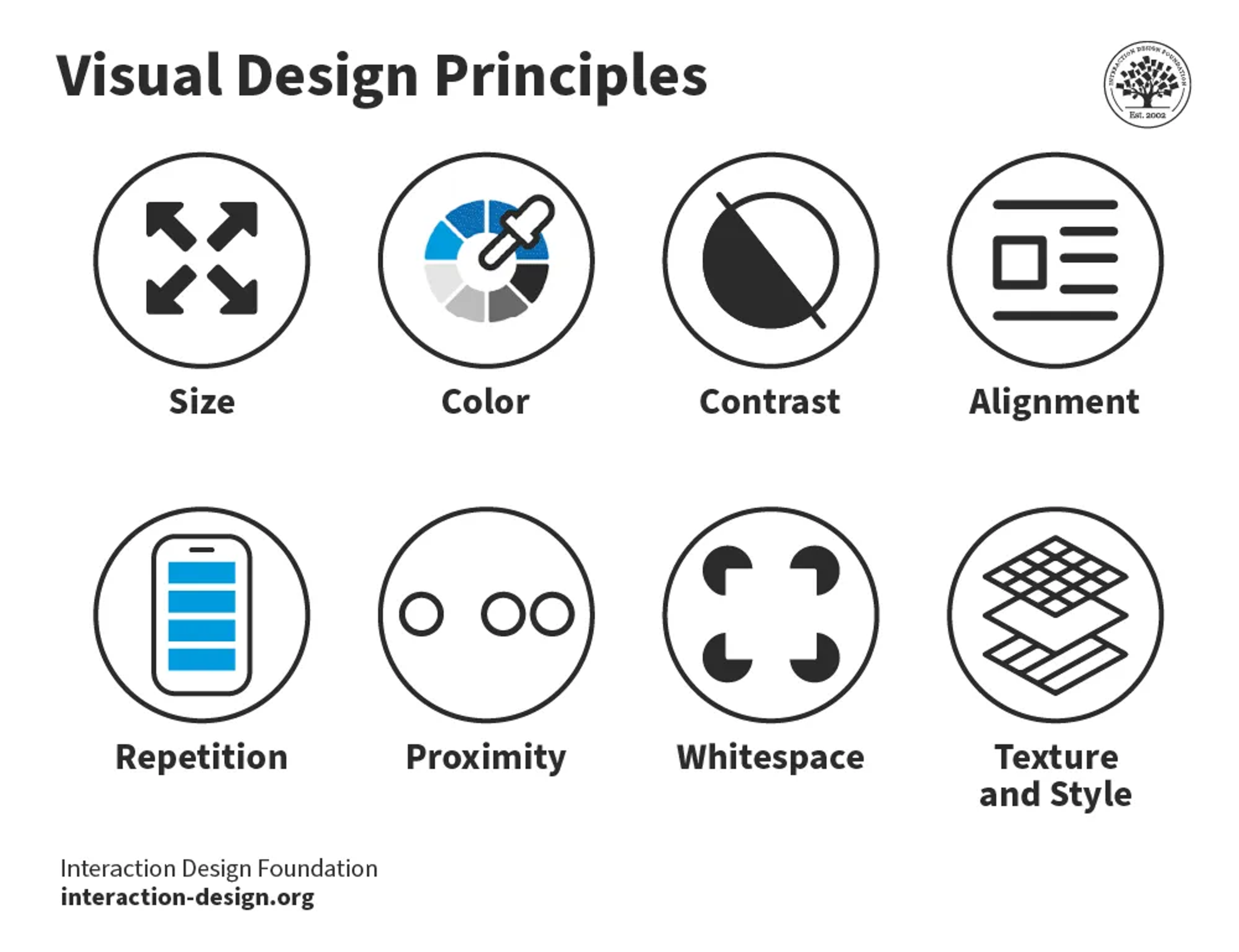
Source: IxDF
Visual hierarchy is an important principle to consider not just for YouTube thumbnail design, but for anything graphic design related. It has to do with guiding the viewer's eye; what text and design elements they notice and in what order. Strong YouTube thumbnail design creates a visual hierarchy that guides the gaze to the most important information.
Here's how to incorporate this idea into your thumbnail design:
Identify the main focal point. This is usually a face, object, or prominent text
Differentiate by size - the most important elements will be larger than the secondary ones
Use of contrast: make the elements you want to draw attention to first have the highest contrast against the background
Position important elements according to natural eye-scanning patterns (usually F-pattern or Z-pattern)
Create a sense of layering by using depth perception
Use Contrasting Colors
We can't talk about the YouTube thumbnail best practices without mentioning how important color psychology is. High-contrast color combinations are always going to be more eye-catching and help to make your YouTube channel's videos stand out. Here are some important details to keep in mind:
Use colors that complement each other (i.e. opposite each other on the color wheel)
Bright colors are known to perform better than muted tones, but use them strategically so as not to overwhelm the viewer
Use bold colors to highlight the most important information, e.g. you can use a color overlay on the background image which results in the foreground elements and text becoming more prominent.
Apply the principles of visual hierarchy. The primary focal point will have the most bold and attention-grabbing colors while the secondary elements can use more subdued colors.
Utilize Negative Space
Don't fill every pixel of your thumbnail. Using negative or empty space helps to draw more direct attention to the most important parts of your YouTube thumbnail. Leave some areas empty to create breathing room for your main elements
By deciding what not to show, you can boost the intrigue element of your thumbnail while avoiding clutter, which is especially an issue when viewing on mobile devices. Negative space makes the focal points of your thumbnail more prominent since they aren't competing with surrounding elements, helping you to emphasize faces, important text, or objects.
Creating Custom Thumbnails
Now that it's time to finally make a YouTube thumbnail, let's briefly go over the process of creating a 4K thumbnail.
You should start by selecting a high-quality starting image to represent your video's content. This can be a frame from your video or something taken from a separate photoshoot. A good base image should have good lighting and clear composition.
You'll want the image to be in a 16:9 aspect ratio, so crop accordingly. Think about how the YouTuber player's time stamp on the lower left corner will look when overlapping with your design. Afterward, you can add the thumbnail text. Avoid long sentences or phrases that require more than a glance to grasp, focusing on large fold fonts that are readable at smaller sizes.
Keep in mind the principles outlined in the previous sections to make deliberate choices about what elements are present in your composition and the space they occupy.
Design Elements
Aside from images and text, you can enhance the impact of a thumbnail with the right design elements. These include:
Borders or frames
Shapes like circles of arrows to focus attention
Icons to quickly communicate the video's topic
Use these elements sparingly and follow the guidelines of visual hierarchy. Avoid overwhelming the viewer - generally, 3-4 design elements are enough.
Use Photo Effects
Photo effects can help grab attention by enhancing the thumbnail's appeal when used wisely.
Some effects you can use:
Blurring to focus on particular areas
Vignette effect (darkened edges) to frame a subject
Color grading to achieve a specific mood
Subtle gradients create depth without distracting from the subject
Branding and Consistency
Your YouTube channel needs to be instantly recognizable. To that end, you have to build brand recognition. The thumbnails for your video are a great way to achieve this. This can be something simple such as finding a way to add your insignia or logo to every thumbnail, to something more stylistic such as the colors and manner of facial expressions you tend to make.
Once you've made a few thumbnails, it's worth taking a step back to see if they all feel like they come from the same YouTube channel. If not, start by trying to keep one thing, no matter how seemingly minuscule, consistent across all future thumbnails.
Create a Custom YouTube Thumbnail with Your Brand Kit
To help with this, you can create a brand kit for your thumbnails to achieve visual consistency across your channel. This will include:
A color palette with 2-3 main colors and 2-3 secondary colors
Fonts
Logo or channel icon placement philosophy
Consistent design elements or patterns that viewers will associate with you
The brand kit will also outline your approach to visual hierarchy across all thumbnails. Having consistent rules is what gives you familiarity in the viewer's eyes.
Consistency is Key
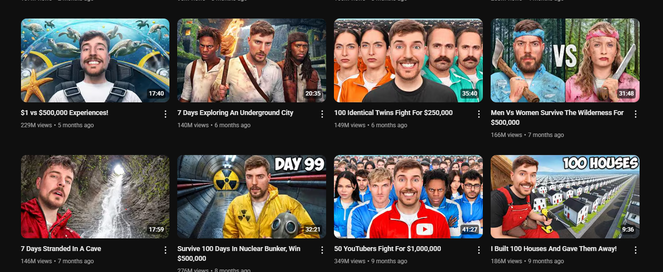
Consistent thumbnail design doesn't necessarily mean that every thumbnail looks the same, just that certain visual elements and stylistic choices create a sense of familiarity and portray your channel's identity.
You should also consider defining different thumbnail templates for each of your video series. So video guides follow one template whereas reaction content follows a different layout. Most successful channels also use a serialized approach to thumbnails for certain content series with only minor changes for each new upload.